Saturday 30 December 2017

Colour Grade - Rest of film

Hover over each image to see it before colour correction!

I'll let the photos mainly talk for themselves - I think the difference is surprising. I'll talk generally about what I did though:

I made the shots darker as the trailer went on.
Fixed blown-out highlights and crushed blacks - mostly a problem in scene two because the camera wasn't exposed properly.
Generally gave the film a similar, stylised look as the trailer went on.
Set the colour scheme - lots of browns, blacks, and off-whites.
Converted several scenes to night time - notably the scene of the main actor and his friend talking on a bench, and the very final scenes. These were originally bright and this was something of a challenge, although I think it worked in the end.


Saturday 23 December 2017

Foley Sound

We used a variety of original foley sounds in our trailer.

Foley Sound in Act 1


In act 1 we deliberately removed almost all of the diegetic sound, to create a smoother montage as the sound wasn't of consistent tone or quality. As such, there was no need for any foley sound, as the feeling of verisimilitude usually created using foley sound and continuity editing isn't needed during a trailer montage.

Foley Sound in Act 2


Act 2 starts with the breakfast scene, which required lots of post-recorded diegetic sound. The tapping on the bowl, the ticking of the clock (which is barely audible, but helps to build intensity and tension in the scene) and the spoon falling onto the table were all recorded separately to the camera shots - hence why some of it doesn't synchronise up that well.

The next scene in Act 2 is Eve using her phone and scribbling in her diary - I recorded sounds of me typing on a phone and scribbling on some paper to add in later. I did this in an environment with soft surfaces to allow me the greatest freedom to use reverb to give an idea of the size of the space in post production. You can here this in the trailer.

Unfortunately we had a sound recording error in the next scene - you can hear that the sound of the footsteps is far too loud in comparison to the voices. Unfortunately, this was very difficult to remove as the footstep sound is a similar frequency to the voice, and we didn't have time to reshoot this scene, so I did my best and moved on. Next time, I would have re-recorded the dialogue in post production (as we did last year) but as mentioned, we didn't have time this year.

The plate smash sound effect is the next example of foley sound - since the plates were made of plaster, they didn't sound like plates smashing using the recorded sound, so I had to source a plate smashing sound effect from a royalty-free website. Next time I would record the plate smashing sound myself, but unfortunately our budget didn't allow for that this year.

Foley Sound in Act 3


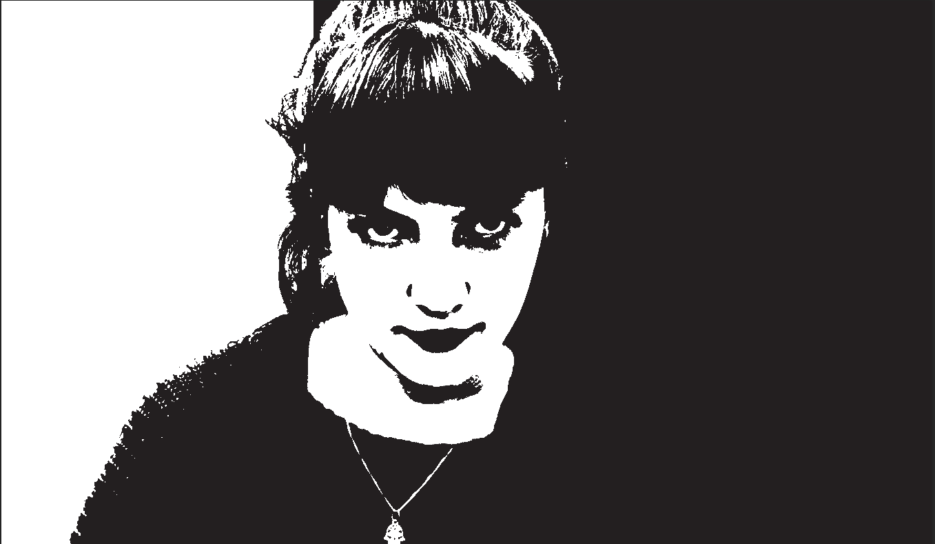
Again, in Act 3 the sound of her removing the knife from the rack didn't build tension in the way I'd hoped so the sound was cut from the piece. The sound of her tying her shoelaces remains, although it is quiet and backgrounded by the singing and music, which means it often goes unnoticed by audiences. I found this out by asking them after showing them rough cuts of the film. 


Next Time


Next time I will think more about other foley sound we might need - splitting into the 3 categories of foley sound:


Feet


In my opinion, we didn't have enough 'stepper' sounds in our film - for example, when Eve walks up the stairs, we hear nothing, when in fact we should hear her on each step and perhaps a creak or two in the final scene. Hearing the father's boots as he comes in would also make a huge difference to the impact his entrance creates.


Movement


Again, our film doesn't have enough movement sound - swishing of clothes, or the sound of hand holding in the first act would have helped heighten the tension in an otherwise 'nice' scene.


Specifics


This is where I feel our film excels (when considering foley sound). We used lots of specific sounds, discussed above, to create a feel of verisimilitude and to heighten the effect of certain scenes. In particular, we wanted the breakfast scene to feel uncomfortable with all the heightened sound. I think this could have been executed much better than we did, with more sound (e.g. tea/milk being poured) and more of a build-up to the climax of the scene. We were unable to do this because of time limits on the length of the trailer, but next time I would definitely make more of an effort on this front. The final scene also would benefit from some more foley sound, such as the knife and steps discussed earlier.

Wednesday 13 December 2017

Sketch Magazine, Extra Features

Initial Sketch Conversion

To convert the picture to a sketch, I converted the layer to black and white, duplicated it, inverted the photo, added a Gaussian Blur to make sure the edges weren't perfectly aligned, before setting the blend mode to Linear Dodge. I then duplicated this layer several times to increase the boldness of the lines to give the result above
Skin
This was the hardest part to get right, and as you can see above, even the finished version is a little off in colour. However, when the other colour was added in this effect was less noticeable.
Hair and Camera
The hair and camera were significantly easier - I just had to be careful about not going out of the lines. Also for the camera I chose a dark grey instead of black so that the lines of the camera still showed up.

Clothing
The clothing was fairly straightforward, as I could really have chosen any colours. I chose to stay faithful to the model's original outfit (although I did increase the vibrance of those colours in this example) and I simply had to ensure I stayed within the lines.

Title/Background
For the title of the feature itself I wanted to stick to the font originally chosen for Photobooth, but adapt it to the Sketch magazine style. I traced over the original title in Illustrator, giving it a black outline and white fill. For the background I filled it light blue and then lightly coloured some patches a darker purple colour (using a brush with a low pressure).

I also did this process for the other two extra features, so I won't write another post on this.

Tuesday 5 December 2017

Ukraine National Film Festival


For my poster, I decided to do something a little unconventional. I decided that since Ukrainians enjoy gritty drama such as The Guide (2014) or The Tribe (2014), they would enjoy the film we have produced which perhaps could almost fall into this category. I drew a top-down view of a stork in photoshop, the national animal of Ukraine, and left a space for text. I then wrote Ukraine National Film Festival 2017, Award Nominee in both English and Ukrainian in the space, prioritising the Ukrainian by putting it above or to the left of any English writing.

Thursday 30 November 2017

Second Poster Idea

After the failure of my first poster idea, I still wanted to do something adventurous and different with my poster. I was looking at posters like Scarface for inspiration -


I liked the two-tone colours and the minimalist design. I felt that this reflected strongly the thriller themes I wanted to convey - the main flaw of the previous poster.

I started with this scene from the film. I chose it because I liked the framing and I felt it could create the correct mood.


I started by posterizing the photo - First I desaturated it so it was only two colours (in this case a sort of sepia) and I coloured in parts of her face, hair, and the background to make them less textured. That ended up looking like this:


That looks a little odd currently, but photoshop's posterize function fixes this:


I added in a review (from The Guardian at this point, although it was my plan to change it later) and a specially-desaturated version of the title.


I was already much more pleased with this poster - however I felt that the traditional thriller red was shockingly absent. To remedy this, I added a red gradient fill layer in all the white spaces - the gradient was to give the background a little more colour than it would have otherwise.


I really liked the result - however, I felt it wasn't complex enough. I decided to adapt this into an even more adventurous poster design - one that I felt would reflect her dual nature.

Monday 27 November 2017

Rough Cut 4


Here is our fourth rough cut - this is our final version without music or titles, we have exported it for the music to be composed to it

What we have changed
  • We have moved the idents to the start of the trailer as we felt where they were they were breaking the tension we had built, this allowed us to put the voiceover of Ruby over the idents, integrating them into our film more 
  • The bus stop scene has now been rotated to be straight
  • We have added in sound from the digital audio recorder from the scenes we filmed later and fixed all of the sound for these scenes
  • We added in black video as markers for where all of our intertitles will go
  • We recorded the extra digetic sound we needed including an extra line of dialogue 

Points to improve

  • We still need to make a main title
  • We have now made intertitles and a billing block but need to add these to the trailer
  • We now have the video to compose music in garage band against so we will begin this very soon

Friday 24 November 2017

Rough Cut 3


Here is our third rough cut

What we have changed

  • We have added in the shots from our two further filming sessions since the last rough cut 
  • We have continued the colour grade, using it to make several scenes appear to be at night such as scene 14


Points to improve

  • We need to sort the sound in the scenes filmed in the last two sessions 
  • We need to rotate the shots at the bus stop as we were on a hill 
  • Also we need to film some diegetic sound for the bus stop and kitchen scenes
  • We still need to make titles and a billing block
  • We also still need to compose music in garage band and add it to the trailer 

Monday 20 November 2017

Rough Cut 2


Here is our second rough cut

What we have changed

  • We have hugely cut down from our first rough cut of 2:47 to 1:24 as we knew we still had a lot to film and titles to add in
  • We have added the sound from the digital audio recorder 
  • We have gone through colour grading every shot in the trailer


Points to improve

  • We still have several place holder scenes to be filled as there is much left to be filmed
  • We need to make titles and a billing block
  • We need to create compose music in garage band and add it to the trailer 

Friday 17 November 2017

Properties - Plates


I made a number of breakaway plates for when we had to smash them - I poured plaster of paris into the bottom of a large bucket and left it to dry for a couple of hours. One of the plates broke in half whilst I tried to extract it from the bucket, but otherwise the plates turned out nicely, good and smooth and perfect for smashing!

Thursday 16 November 2017

Ident 2 - Fireline

For our second ident, Fireline, I decided that we wanted some fire (inspired by the title) to spread out into bubbles across the screen. I executed this by using various effects, mostly CC Particle Systems, using the 'Fire' physics mode, and a particle type of Bubble.

I also increased the birth size and decreased the death size to make the particles grow smaller as they rise, giving a stronger idea that they come from one point. I changed the longevity and birth rate to have the particles last less long (to give a fading away look at the top of the fire) and spawn more frequently (to give an idea that this is a roaring fire) respectively. I made sure to change the colours so that the particles were a gradient of orange the whole way through the animation. I adjusted the velocity and other parameters - from here on it was just a case of fiddling with things until I got the look I wanted. I also used a motion blur, Vector Blur, Fast Blur, Directional Blur, and Echo (although faded these out when the fire turns to bubbles) to blend the particles together and give more of a firey look. I also added a curves adjustment to make the fire more orange and a turbulent displace and a Glow to tie everything together. I then played around with the Direction, Resistance, Gravity, Extra, and Velocity settings to get a bubble result I was happy with.

Rough Cut 1 - Audience Feedback

We showed the rough cut to a group of people to hear their feedback on what they liked about it and what they thought we could improve on.

What they liked
  • They commented on the fast editing of the diary between the close ups of words and the mid shot of the whole open book
  • They also liked the colour grade of the whole trailer
  • They thought is was very easy to understand what was going on
Points to Improve 
  • Change the edit in scene two to slow down the pace of it so it does not feel as rushed and confusing
  • Add in the music which will hopefully lift it all 
  • A lot of work needs to be done to the diegetic sounds, which we will fix by adding in the sound from from the Digital Audio Recorder.

Initial Poster Idea

Initially, I wanted to go for a poster to reflect the happy nature of the first act of the trailer, but with some deformity showing how everything is not as it seems. I decided to go for this shot from the film as I thought it was a very nice looking shot and I could do lots with it.


However, I could not find a still from the film where both of the actors were looking nice - as you can see here, it looks like our main actress is mid-sneeze. I chose to use two different stills, which I carefully blended together to give the result below.


I'm really pleased with the result - you can hardly tell that there are two shots there - the discolouration on the girl's hair was actually an in-camera error. After blending the photos, I added a levels adjustment to increase the contrast a little - the final grade is on the top, original on bottom for comparison, as it can be quite difficult to see the difference otherwise.


I added in the title from the film - this creates a brand coherency we were keen to achieve with our ancillary marketing products.


I then started to add some film festival logos, like these ones:


Giving a final, unfinished result:


However, in the end I decided that my initial idea was flawed - I felt that this kind of poster didn't truly reflect the thriller genre, and wouldn't be able to get across the intended meaning effectively. I scrapped this project, and started again.

Wednesday 15 November 2017

Rough Cut 1

Here is the first rough cut for our final product, we have put all of the clips filmed on day 1 and 2 of filming together along with the idents. The colour grade has begun on some of the shots but there is still a long way to go on many. Currently the only sound for all of it apart from scene 1 is camera sound so this will need to be replaced with sound from the Digital Audio Recorder. Also currently it reaches 2 minutes 48 seconds in length with still 4 scenes to film, making it well over our target of 2 minutes so we plan to cut a large amount of it down.

Monday 30 October 2017

Scene 1 Filming

We arranged to meet our actors at 2pm at the location for the last shot of the scene, we made the conscious decision to film the last shot of the scene first as we wanted it to stand out from the others and to seem at bit off. We chose to convey this through the tight shot with the backdrop of a brick wall juxtaposing the previous green open shots. On top of this we hoped our chose to film it first would give the two actors took time for the chemistry to build between them so they would seem more natural together, giving off the impression that they were in fact in love in the previous shots chronologically in the film

We experienced a few problems getting the sound to work at first which held up the filming of the first shot, despite this, once we started everything went very smoothly with no problems apart from having to deal with a few passers by which was to be expected with filming in a public location.

We managed to finish filming the scene within 2 and a half hours getting every shot on our storyboard with the exception that we changed the pedalos shot to on a bridge as the pedalos were shut up because of the weather. However, it turned out for the better as the bridge which we had not noticed on our location scouting ended up being a very cinematic location.

See below a photo of us setting up to film the first shot

Tuesday 10 October 2017

Scene 1 Colour Correction


I have had improved my colour correction for scene 1.

Below I have put some screenshots of my efforts. In general I increased the contrast by lowering the shadows (and sometimes blacks) a bit and increasing the shadows. The cloudy day meant that I have increased both the temperature and saturation to make the film look more autumnal/end-of-summery than overcast. On the brick wall shot I added some sharpness.


Before                                                                     After


Before                                                                     After


Before                                                                     After


Before                                                                     After


After                                                                       Before


After                                                                       Before


After                                                                       Before


After                                                                       Before


After                                                                       Before

Monday 9 October 2017

Scene 1, Rough Cut 1


Here is the first rough cut of our film. I have matched together the sound from the DAC and the video. This was especially tricky in the scene below because of the placement of the boom mic - it is behind the pillar nearest to the actors at the start. Because of the mic in this position, the sound of running was less than optimal. I used the sound from the camera microphone to fix this a little. The in-camera sound was fine because it's a prosumer camcorder (so designed to have good sound quality) and not a DSLR.


I also had a quick look at a first view of some colour correction/grading. I did this because it was set on a sunny day but the shooting day itself was rather overcast. It is very much a first draft but it's good to get an idea.

Friday 6 October 2017

Location scouting - House


 Here you can see the house we have chosen to use to shoot all of our inside scenes. We chose it because of the very cinematic feel we felt it had, especially at the table that we plan to shoot scene 2 at, it is next to large French Windows which will create the bright open shot we want for the first act of our film. In contrast to this, the hallway that can be seen on the right, to be used in scene 10, will work well for the Dutch angle silhouette shot of the father. The bedroom at the top above will be used in scene  8, 13 and 16, it looks like a very stereotypical teenage girl's room which is the look we are going for and we will be able to play around with a combination of natural lighting from the window and the bedside lamp see above.