Saturday 30 September 2017

Generic Conventions of the Film Poster

Having looked at several film posters, there are several conventions particular to the thriller/horror genre.


  • Colour Scheme - Predominantly red, white, and black, because of the connotations of danger, blood, passion, violence, purity, etc.
  • Title - Usually in the bottom third, uses a very large font to draw attention to it. Often in red, although sometimes white on a black background to make it stand out.
  • Key Actors - In larger films, these are a way of guaranteeing an audience for the film, so you want to sell this to the viewer. As such these are usually at the top of the screen. This can also include famous directors or other creative crew members, e.g. "from the director of..." or even sometimes "from the producer of..."
  • Images - usually one image taking up the whole background, almost always of one of the stars of the film. There will often also be one or more smaller photos in the frame, such as the silhouetted figure in front of Cameron Diaz above.

  • Slogan - This varies, but usually in the top two thirds of the poster will be a 3 or 4 word slogan to sum up the film. 
  • Release Date - Often placed right at the bottom of the poster, the release date will often be highlighted in some way, either being slightly bigger, bolder, or in a different colour to the surrounding billing block.

Friday 29 September 2017

Shot List

Here is the first draft of our shot list - we used Celtx's script tagging feature to start and then filled in more shots as and when we needed them. This is of course a working document and the copy below is not final.

Friday 22 September 2017

Script, First Draft

Here is the first draft of our script. We use Celtx, an online script writing and production management software, to make our script look like the real thing. We will also be using this to create our shot list.

Wednesday 20 September 2017

Questionnaire Results

Below you can see the results from our questionnaire
  1. A large majority of the people who answered were in the 15 - 24 age range, which suggests that this will be the most common age range in the audience of our film. This means we should attempt to target it to this age group
  2. We managed to get a very even split between women and men which is very helpful as it gives a blackened perspective and me hope to target or film to both females and males
  3. The most popular genre of film was thriller, followed by drama. This works well for us as we plan for our film to begin off as a drama but over time progress into the thriller genre
  4. The most popular aspect of a trailer was the cinematography followed by the music choice so we will attempt to put most emphasis on these features of our trailer when in production 
  5. Here we have all variety of different aspects that we could get inspiration from to use in our film, such as
    • Music choice
    • Not revealing too much of the film
    • Using colour to represent the mood
    • Mixture of longer shorts and high editing speed
    • Cinematic locations


Monday 18 September 2017

Recce

We went on a recce and made a short film of our location shots to give some more depth to the location on screen and see if they worked out. This helped us to find locations for most of act one of our trailer as well as a bus stop and an alleyway.

Sunday 17 September 2017

Generic Conventions of the Trailer


Production Information
  • Trailers regardless of genre show the production companies' logos, for a higher budget or mosaic-funded film there can be more than one. This is usually fairly early on in the trailer. This is done because audiences for production companies will be similar across films. For example Pixar released Cars 3 earlier this year - next year their tentpole production is The Incredibles 2, a much-awaited sequel to the 2004 family hit. Audiences for the Cars film will likely want to see the Incredibles 2 so displaying the Pixar logo during both the Cars film and the Incredibles trailer will show the audience that this is a similar film and that they will likely enjoy it.
Film Title
  • Almost always appears at the end of the film, in large, distinct font. This tells the viewer a lot about the film genre - A thriller title will follow the general thriller convention of white, red, and black, while an action title will likely be accompanied onto the screen with some form of explosion or special effect, with a dramatically large title and an overly dramatic voice announcing the text as it appears.
Plot
  • Trailers try to give the audience an indication of the plot without giving too much away. This is a fine line however, as too little plot will be seen as boring and too much plot will reveal too much of the story. Good trailers usually contain the funniest, most visually stunning, and scary parts of a film without giving the whole thing away.
Famous Actors
  • Much like the poster, trailers will place their most famous stars at the top, in the first scene. This can be seen in almost every trailer. Their names will be displayed in large font across the trailer as well, to bring more attention to it.

Saturday 16 September 2017

Character and Costume


Above you can see a powerpoint I have made to plan the characters and costume that will be involved in my film.
I have decided since making it to replace the Aunt character to with the father of the girl but have chosen to leave the Aunt in here to display the development and changes made to my initial idea during the planning process.

Friday 15 September 2017

Generic Conventions of the Magazine Cover

In general on a film magazine poster, there are certain conventions. For example:


  • Masthead - the name of the magazine, displayed large at the top and distinct from the background. This tends to be identical across editions, to identify the magazine.
  • Background Image - Generally a simple image to do with the main film featured in the issue, be it publicity shots, a still frame, or an artists rendition, it usually portrays one or more of the lead actors from the film. It takes up the whole of the page and is designed to draw the viewer's attention.

  • Film Title - Often in the very centre of the page, roughly the same size as the magazine title and telling the viewer what the feature article is about. This convention is often subverted however, as above.


  • Skyline - a catchy slogan to grab the reader's attention on a magazine rack in a shop. Normally it's about the magazine itself (see Sight & Sound) or about the film (see Empire. Note, however, that Empire do still have a slogan about the magazine, but below the title).

  • Other Features - This is probably the most changeable element of a magazine, even from issue to issue. This is usually some text and/or a pictures describing other articles in the magazine. This is in black text on the Empire magazine cover above.

Casting Notes

EVE - For the main protagonist of my tailer I have chosen her to be played by a friend of mine Ruby Ballantyne who is currently a drama scholar at her school and is applying to study drama at university. She also fits the age and character demographic that I was looking for.

NOAH - For the second main actor I chose another friend Robert Jones, who me and my partner agreed would loo good on screen and fit well alongside Ruby. Also the actors got along well which would make it easier for them to act their on screen relationship realistically.

THE PARENTS AND SISTER - For Eve's mother and father are initial plan was to ask two friends of my partner who were professional actors however they had prior commitments in a West End show so instead we asked a friend Olivia Bremner's parents, Tessa and Geoff Bremner as they looked similar enough that they could be Ruby's parents but also we decided to have Olivia play Ruby's sister to make her seem even further out of place in the on screen family, as the rest of her on screen family is a real family with her the only odd one out.

Narrative Theory

Narrative Theory

I will have a look into five narrative theorists and how my media product matches or subverts each of their theories.

Joseph Campbell

Campbell, said to be one of George Lucas' main influences in the Star Wars films, argued that all films are essentially a battle between good and evil, that 'eternal myths and stories are shared by all cultures'. Looking at our film we have taken a slightly alternative approach to the traditional idea of a battle between good and evil, we placed both of these archetypes into our main protagonist, to represent how no person can be truly could or evil. Throughout the film you still see Campbell's war between good and evil but it takes place as an internal struggle within Eve.

Vladimir Propp

Propp argued that whatever the story was it is possible to group the characters into eight 'sphere's of action' as he called them, to indicate how intertwined he felt character and action are.

These are:
  • The villain
  • The hero - seeks something, carriers the events of the story
  • The donor - provides a magical object
  • The helper - aids the hero
  • The princess - often object of the villians schemes
  • The father - rewards the hero
  • The dispatcher - sends off the hero
  • The false hero
Our film does not quite match up to these, but we still have some of the key roles in ours:

  • Eve
  • Noah - It could also be interpreted that Eve still is the main hero of the story throughout
  • No one - As it is not a fantasy there are no magical objects or anything with similar connotations
  • Ben - Is there to support the hero throughout and aid him
  • The Mother - Is the vulnerable one who is targeted by the villain
  • No one - Despite our story having a father figure in the form of Eve's dad he is not the traditional caring father and is not there to reward
  • Noah
  • No one - As our hero is never on a journey any where there is never anyone to set them off, it could however be seen as Eve setting him off on a metaphorical journey from the beginning of the film
  • Eve - At the beginning of the film you assume she is the hero

Tzvetan Todorov

Todorov was a structuralist and he believed that every narrative started with an 'equilibrium' where all of the forces are 'in balance'. This is then disrupted causing a chain of events ending in a new 'equilibrium' In our film we have:

  1. Equilibrium, where Eve and Noah are happy together, or appear to be so and the same goes for Eve's family.
  2. It begins to be shown the Eve is not a usual teenage girl, her outbursts become increasingly frequent. It is also revealed to the audience that Eve's father walked out on them when Eve was a young child because he could not handle Eve's 'moods' and he could not deal with Eve's mothers refusal to seek help for their child.
  3. The recognition comes far too late when Eve's mother discovers her diary and realises that those thoughts she had been suppressing her whole life that her daughter was not like other children were right. However, as soon as this realisation takes place we seen Eve entering the room with a knife, preparing to kill her mother.
  4. With the mother dead the father enlists the help of Noah as they decide something has to be done to limit any further damage from Eve.
  5. Here is where our film subverts from Todorov's theory as it does not end with a new equilibrium, instead the final shots of the film show Eve deciding to kill herself, leaving it ambiguous whether it was an act of thoughtless rage or her all consuming guilt from the murder of her mother. 

Roland Barthes

Barthes suggested that all narratives make use of five different codes which the reader has to work to understand. He argued that the readers themselves have a role in making the meaning of a film. Barthes also discussed how all films have one of two endings:

  • Closed - Everything is sealed up with all questions answered
  • Open - Questions left unanswered

Our film has a very open ending as the viewer never truly understands what is going on inside Eve's brain and why she commits these atrocious acts against those she cares about the most.

Claude Levi-Strauss

Strauss argued that all narratives is dependent on binary oppositions such as East and West or good and evil. In our film there is a clear binary opposition within Eve, manifesting in to good and evil. She spends her life either taken over by an unquenchable anger and desire to inflict pain on others or an all powerful guilt for the acts she has committed and a fear for what she is yet to do. These fit exactly with Strauss' ideas as they could not be more polar opposite from each other.

Thursday 14 September 2017

Titles Test 2

For our titles I ventured onto dafont.com whereupon I encountered this font, Mocking Bird.

We like this font because of the handwritten feel and we thought it would be simple to create this in after effects for our intertitles.

I used after effects' Stroke effect to draw a mask in the shape of the text and reveal it, following the shape of the original text. I have taught my partner how to do this too (she did the 'Emma' one) and we both really like the effect it creates.

Wednesday 13 September 2017

Sound and Music


For the first act in our trailer we have decided that we want light and piano-heavy (perhaps some strings also) music to create a relaxed atmosphere. It should have a summer feel, as well as being as minimalistic as possible.
In the second act we want the music to be more dramatic, have more instruments, and be much less relaxed.
The third act has three parts:
  • The first part of the third act will be similar to the second act, but yet more dramatic and very rapid. The music should build to a climax.
  • The second part of the third act will be much slower, but still share motifs with the first two to link it all together. We will add some violin (or similar) at this point to increase the creepiness.
  • The third part of the third act will consist purely of the girl singing, with perhaps one instrument (A xylophone or glockenspiel if I can find one) to increase the creepiness levels.
Throughout the piece we want to have a few motifs that knit the whole trailer together.


In terms of sound, we want a range of diegetic sound to build verisimilitude throughout the piece, as well as some dialogue-as-voiceover to act as a sound bridge between scenes. We will do this because it is a convention of the trailer form.

Tuesday 12 September 2017

Ident Testing


This is my initial attempt at an ident. It consists of a grid made of an Advanced Lightning effect, with the Lightning Type set to Bouncey, Forking to 100%, Minimum Fork Distance to 10 pixels, Complexity to 2, and Glow to 0. I then added some red glow over the top and a gold title to give it a cool effect.

After talking to my partner, we decided to make the ident redder as we thought it would fit more firmly into the thriller genre. I did this by decreasing the green and blue Curves adjustment.

I was dissatisfied with the result, as I had initially liked the more golden flash. I added this back in and my partner and I agree that this looks much nicer. I also made the background more red so as to distinguish it from a title.


Here is my first attempt at what our titles might look like - the 'dust' is made of 50,000 particles per frame and this took a very long time to render. It will be a consideration going forward.


We like the font for the ident as we think it fits with both film and genre but the text for the titles is too generic and doesn't really match the thriller genre.

Murder on the Orient Express


  • The production information is shown at the beginning of the trailer
  • We open on several establishing shots of the Orient Express - it's snowing, a waiter prepares a table, etc. This sets the scene.
  • We are introduced visually to some of the characters having dinner, before Poirot's voiceover begins.
  • We see Johnny Depp's sly smile before we cut to black. Wheels screeching and a man screaming can be heard as we flash back in to shots of train wheels, and then to black again.
  • We then see a blue intertitle - 'this November'. The blue text mirrors the ice - cold and harsh - and the contents itself tells the audience when they can see the film.
  • There is a non-diegetic swell of music and Poirot's voiceover continues over black - 'a passenger has died.' This emphasises this moment. It is interesting that the first half of the trailer is entirely exposition, before we find out what has happened.
  • The music changes to a more upbeat and suspenseful piece as Poirot begins his search for the murderer.
  • There is a POV shot of Poirot walking down the train, which simultaneously makes the reader empathise with him and also introduces all of the other characters through titles that track them.
  • After the man asks 'who are you?', there is another cut to black and swell of music (which adds drama) and a slow pan up as Poirot says his line. 
  • After Poirot's line, the music swells and crashes again over the title. Then we see the cast and awards they've won which brings an audience to the film.

Monday 11 September 2017

Locations Plan

We plan to go scouting our possible locations later this week and take trial shots with the camera we plan to use for our final trailer, to get an idea how it will look. See below our list of possible locations along with photos of them taken from google maps street view....

Park - Dulwich park?
House - INT
Basement - Emma's Cellar?
Will need to take trial shots of these ourselves
House - EXT, here are three different possible uses we could use
Dark alleyways - Firemans alley?
Screen Shot 2017-09-12 at 15.11.39.pngScreen Shot 2017-09-12 at 15.11.56.png
School
Bus Stop
  
Tunnel - Possibly Herne Hill Station/ Brixton/ Balham

Sunday 10 September 2017

Saturday 9 September 2017

Questionnaire Plan

I have decided to use Survey Monkey to produce a questionnaire to help me and my partner make key choices in our film based on our taggert audience's opinions. We will distribute this to friends, family and teachers to get responses from a variety of ages as we hope our final product will be able to fit all age groups.
Here is the link to it https://www.surveymonkey.co.uk/r/Y53WNHR
See below screenshots of the questions...

Friday 8 September 2017

Certification


The British Board of Film Classification (BBFC) presents the following guidance for film classification:

Discrimination

"The work as a whole must not endorse discriminatory language or behaviour, although there may be racist, homophobic or other discriminatory themes and language." 

Our film definitely conforms to the guidelines here - women are not explicitly discriminated against, Eve's mental health problem is not explicitly stated and no other minorities are obviously present.

Drugs

"Drug taking may be shown but the work as a whole must not promote or encourage drug misuse (for example, through instructional detail). The misuse of easily accessible and highly dangerous substances (for example, aerosols or solvents) is unlikely to be acceptable."

Drugs are not used in our film.

Imitable behaviour

"Dangerous behaviour (for example, hanging, suicide and self-harming) should not dwell on detail which could be copied. Whether the depiction of easily accessible weapons is acceptable will depend on factors such as realism, context and setting."

The closest thing to imitable behaviour in our film would be when Eve decides to commit suicide at the end of the film - however, since we only see her decide to kill herself, it is not shown in any detail so does not really fall under imitable behaviour. Easily accessible weapons are portrayed (for example the knife scene, just before killing her mother) but are looked upon generally disapprovingly. The knife is not glamorised so falls within this bracket.

Language

"There may be strong language. Very strong language may be permitted, depending on the manner in which it is used, who is using the language, its frequency within the work as a whole and any special contextual justification."

Some strong language may be used, but very strong language will not be applied. Strong sexual expletives will not be used at any stage.

Nudity

"There are no constraints on nudity in a non-sexual or educational context. There may be nudity in a sexual context but usually without strong detail."

There will be little to no nudity in our film - it is unnecessary in our case. Any nudity will not be in a sexual context.

Sex

"Sexual activity may be portrayed, but usually without strong detail. There may be strong verbal references to sexual behaviour, but the strongest references are unlikely to be acceptable unless justified by context. Works whose primary purpose is sexual arousal or stimulation are unlikely to be acceptable."

No sexual activity is portrayed. No verbal references to sexual activity are made. Our primary purpose is not to arouse or stimulate.

Threat

"There may be strong threat and horror. A sustained focus on sadistic or sexual threat is unlikely to be acceptable."

There will be strong threat in our film but it is not sexual or sadistic - the threat is Eve, but we don't know why she is threatening people in this way.

Violence

"Violence may be strong but should not dwell on the infliction of pain or injury. The strongest gory images are unlikely to be acceptable. Strong sadistic violence is also unlikely to be acceptable. There may be detailed verbal references to sexual violence but the depiction of sexual violence must be discreet and justified by context."

Our film will contain strong violence, for example when she kills her mother, but we will be careful to portray it in such a way that little gore is present.  Sexual violence is not present.


In light of all these, we have chosen to give our film a 15 – Suitable only for 15 years and over rating.


GH

The Beguiled Trailer Analysis

Camera

  • Open with wide (and then close-up) shots of little girl in forest - a touch of 'little red riding hood'. Foreshadows something bad happening
  • Very very smooth movement throughout
  • Closes with the shot of a key turning in a door - symbolic


Mise-en-Scene

  • Dust blowing through forest in opening shot is quite creepy
  • Girl's hair is plaited in a very childish way, showing her innocence and purity
  • Girl is picking mushrooms - foreshadowing his death by poisonous mushroom later in the film
  • Very soft lighting and largely warm but dim shots throughout show comfort of the house


Editing

  • Begin with very slow editing
  • Cut to black and fade back in after finding man foreshadows how he will change their lives
  • After the peripeteia the editing speed becomes much faster, helped by the start of the inter titles
  • Ends in the traditional trailer style of title and then release date


Sound

  • Soundtrack begins with little girl's voice, singing. This is very eerie when matched with the dust blowing through the forest. Enhanced footsteps and diegetic sound make the audience think something is about to happen.
  • Speech is very soft and kind until the peripeteia - they are welcoming
  • After the peripeteia the music becomes very dramatic and there is less and less dialogue

Inception Poster Analysis


Thursday 7 September 2017

Institutional Analysis - Little White Lies


The Cover


Not a traditional film magazine cover - illustration of the film rather than production photos or stills
Little text other than the film & magazine titles - no advertisement of what's inside.
These help the magazine to stand out.
However cover still has masthead, price, issue number, barcode, slogan. You would expect these of any magazine.
Sometimes colour-in covers - appeals to more artsy people?

They say they 'look for new ways of combining cutting-edge editorial and graphic design while remaining dedicated to championing the best film talent from around the world' - the look of the magazine is just as important as the content

Published by a small, relatively unknown company called TCOLondon

According to the Mosaic UK demographic study:
Little White Lies main target audience can in be found in Group O - Urban Intelligence that ‘mostly contains young and well educated people who are open to new ideas and influences’. Group E are young people that will have gone through higher education, be of liberal idea, have access to disposable income and be open to new experiences and value ‘authenticity over veneer’. This fits perfect in to Little White Lies values that attempts to be: A new type of film magazine. Adopts a serious tone about film. Is aimed at an inner city (mainly London) readership. Claims to be about Truth so aims to have ‘authenticity’. The tone of the writing is high-brow analysis and exploration of themes so anticipates (maybe requires) an intelligent readership. The design of the magazine is often abstract and arbitrary aimed at a design and brand savvy consumer.

Circulation:
Print magazine, some articles available online

One copy costs £6-10, making it the most expensive of the three magazines

Tuesday 5 September 2017

Clockwork Orange


The white background of the poster symbolises purity and innocence, which the character in the black seems to be bursting through - a metaphor for the film's plot.
The colour scheme of the poster is black and white, with the man being very orange, reinforcing the film's title.
No awards or quotes are placed on the poster.
The tagline also reinforces the film's plot of stylised violence etc. as if rape and ultra-violence are in the same class of hobbies as Beethoven.
The man in the giant 'A' is holding a knife which seems to come towards the viewer in 3D, drawing them in to the poster.
There is a floating eye, reflecting a point in the film's plot.
The 'A' in Orange is the same (but smaller) as the 'A' the man is in

Friday 1 September 2017

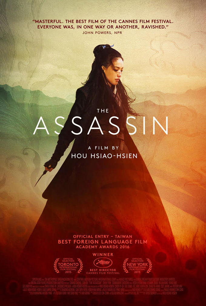
The Assassin


'The Assassin' is a Chinese-language film. Often in foreign-language films, they try to hide it in their marketing material, but The Assassin has it right in the middle of the poster to draw attention to it - this shows an unconventional attitude.
The background of the poster has a very arthouse look, the pastel watercolours indicating this most prominently.
The director, Hou Hsiao-Hsien is in large writing as a previous credit, but there are no other names on the poster. Hou is a big name in Taiwan and mainland China, so this makes sense in this case. 
In the background of the poster are some things that look almost like smoke or clouds, perhaps connoting a smoking gun. This is reinforced by the weapon the actress has in her hand.
Many awards are also placed in large type in the bottom half, reinforcing the arthouse audience.
The actress is also brought to prominence through hiding two of the letters of the title behind her.