
I started by drawing our main actress in the same style as my 'extra features' at the bottom of the magazine, discussed in a previous post. Essentially, this consists of turning her into an outline and then manually colouring her in. I've put two screenshots here to outline the process:


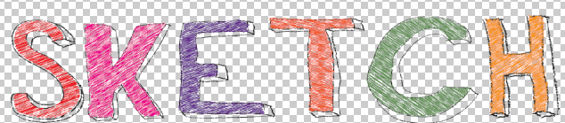
With my main feature's photo finished, I started on the title of the magazine. Having been colouring in for ages, I decided on Sketch Magazine as the name, and this cool hand-drawn style below for the design. I really like what I've done here.
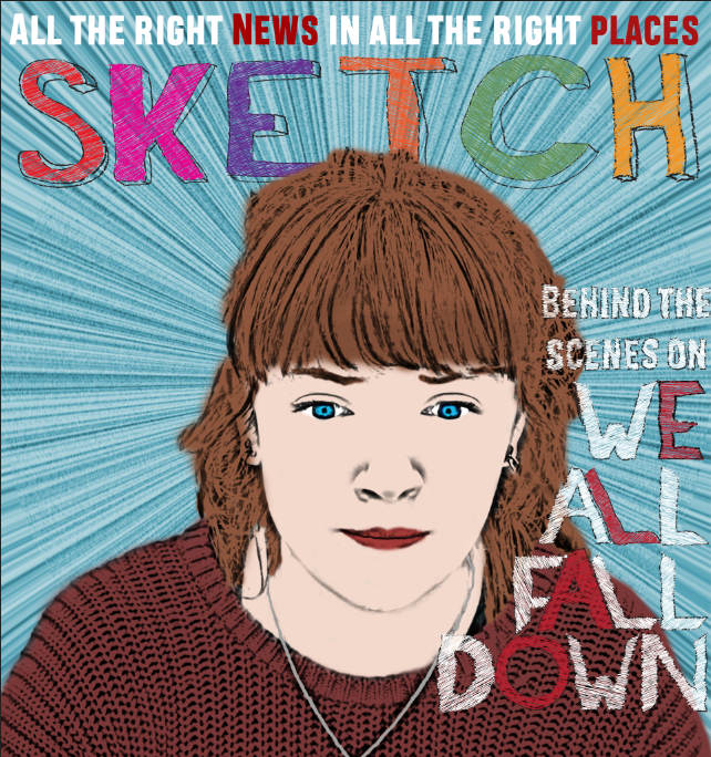
For the background to the main part of my magazine, I settled on this radial blue design, created in photoshop. I like it because it really draws the eye to the centre of the poster.

I used Illustrator to trace over the film's title and give it the same hand-drawn look - I actually ended up doing this on almost every piece of text on the magazine. I positioned the text so that it fell around her face, in a convention of the magazine.

Putting all that together with a tagline for the magazine at the top, we get the following result, which I think is a great art-house style.
Of course no magazine would be complete without a bar of extra features in the magazine, and mine ended up looking like this with a bar-code and title:

The actual creation of extra features is covered in another blog post.
The final poster is below, and I'm very pleased with it.

No comments:
Post a Comment