Showing posts with label Magazine Cover. Show all posts

Thursday, 15 February 2018

Sketch Magazine

For my magazine, I had a strong idea of what I wanted - a hand-drawn look to the poster, similar to Little White Lies, with everything artificial and brightly coloured. I decided I could probably achieve this in Photoshop, which is good as you may have seen my actual drawing skills from another post.

I started by drawing our main actress in the same style as my 'extra features' at the bottom of the magazine, discussed in a previous post. Essentially, this consists of turning her into an outline and then manually colouring her in. I've put two screenshots here to outline the process:


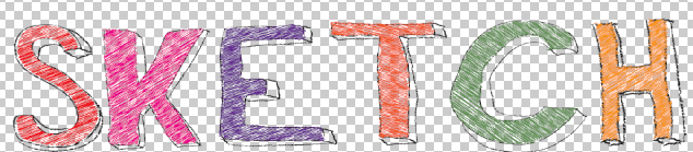
With my main feature's photo finished, I started on the title of the magazine. Having been colouring in for ages, I decided on Sketch Magazine as the name, and this cool hand-drawn style below for the design. I really like what I've done here.


For the background to the main part of my magazine, I settled on this radial blue design, created in photoshop. I like it because it really draws the eye to the centre of the poster.


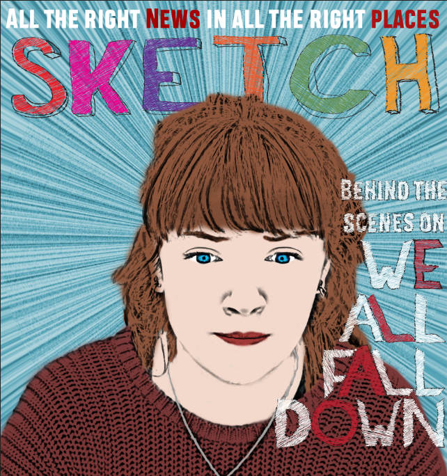
I used Illustrator to trace over the film's title and give it the same hand-drawn look - I actually ended up doing this on almost every piece of text on the magazine. I positioned the text so that it fell around her face, in a convention of the magazine.


Putting all that together with a tagline for the magazine at the top, we get the following result, which I think is a great art-house style.

Of course no magazine would be complete without a bar of extra features in the magazine, and mine ended up looking like this with a bar-code and title:


The actual creation of extra features is covered in another blog post.

The final poster is below, and I'm very pleased with it.


Wednesday, 13 December 2017

Sketch Magazine, Extra Features

Initial Sketch Conversion

To convert the picture to a sketch, I converted the layer to black and white, duplicated it, inverted the photo, added a Gaussian Blur to make sure the edges weren't perfectly aligned, before setting the blend mode to Linear Dodge. I then duplicated this layer several times to increase the boldness of the lines to give the result above
Skin
This was the hardest part to get right, and as you can see above, even the finished version is a little off in colour. However, when the other colour was added in this effect was less noticeable.
Hair and Camera
The hair and camera were significantly easier - I just had to be careful about not going out of the lines. Also for the camera I chose a dark grey instead of black so that the lines of the camera still showed up.

Clothing
The clothing was fairly straightforward, as I could really have chosen any colours. I chose to stay faithful to the model's original outfit (although I did increase the vibrance of those colours in this example) and I simply had to ensure I stayed within the lines.

Title/Background
For the title of the feature itself I wanted to stick to the font originally chosen for Photobooth, but adapt it to the Sketch magazine style. I traced over the original title in Illustrator, giving it a black outline and white fill. For the background I filled it light blue and then lightly coloured some patches a darker purple colour (using a brush with a low pressure).

I also did this process for the other two extra features, so I won't write another post on this.

Friday, 15 September 2017

Generic Conventions of the Magazine Cover

In general on a film magazine poster, there are certain conventions. For example:


  • Masthead - the name of the magazine, displayed large at the top and distinct from the background. This tends to be identical across editions, to identify the magazine.
  • Background Image - Generally a simple image to do with the main film featured in the issue, be it publicity shots, a still frame, or an artists rendition, it usually portrays one or more of the lead actors from the film. It takes up the whole of the page and is designed to draw the viewer's attention.

  • Film Title - Often in the very centre of the page, roughly the same size as the magazine title and telling the viewer what the feature article is about. This convention is often subverted however, as above.


  • Skyline - a catchy slogan to grab the reader's attention on a magazine rack in a shop. Normally it's about the magazine itself (see Sight & Sound) or about the film (see Empire. Note, however, that Empire do still have a slogan about the magazine, but below the title).

  • Other Features - This is probably the most changeable element of a magazine, even from issue to issue. This is usually some text and/or a pictures describing other articles in the magazine. This is in black text on the Empire magazine cover above.

Sunday, 10 September 2017

Institutional Analysis - Empire


Here is a prezi I made, exploring Empire magazine as an institution.

One copy costs £5.

Thursday, 7 September 2017

Institutional Analysis - Little White Lies


The Cover


Not a traditional film magazine cover - illustration of the film rather than production photos or stills
Little text other than the film & magazine titles - no advertisement of what's inside.
These help the magazine to stand out.
However cover still has masthead, price, issue number, barcode, slogan. You would expect these of any magazine.
Sometimes colour-in covers - appeals to more artsy people?

They say they 'look for new ways of combining cutting-edge editorial and graphic design while remaining dedicated to championing the best film talent from around the world' - the look of the magazine is just as important as the content

Published by a small, relatively unknown company called TCOLondon

According to the Mosaic UK demographic study:
Little White Lies main target audience can in be found in Group O - Urban Intelligence that ‘mostly contains young and well educated people who are open to new ideas and influences’. Group E are young people that will have gone through higher education, be of liberal idea, have access to disposable income and be open to new experiences and value ‘authenticity over veneer’. This fits perfect in to Little White Lies values that attempts to be: A new type of film magazine. Adopts a serious tone about film. Is aimed at an inner city (mainly London) readership. Claims to be about Truth so aims to have ‘authenticity’. The tone of the writing is high-brow analysis and exploration of themes so anticipates (maybe requires) an intelligent readership. The design of the magazine is often abstract and arbitrary aimed at a design and brand savvy consumer.

Circulation:
Print magazine, some articles available online

One copy costs £6-10, making it the most expensive of the three magazines