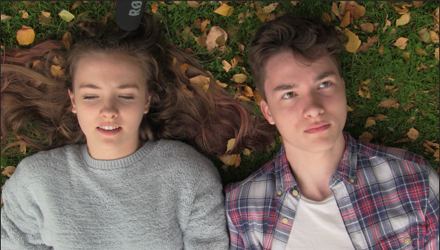
Initially, I wanted to go for a poster to reflect the happy nature of the first act of the trailer, but with some deformity showing how everything is not as it seems. I decided to go for this shot from the film as I thought it was a very nice looking shot and I could do lots with it.
However, I could not find a still from the film where both of the actors were looking nice - as you can see here, it looks like our main actress is mid-sneeze. I chose to use two different stills, which I carefully blended together to give the result below.
I'm really pleased with the result - you can hardly tell that there are two shots there - the discolouration on the girl's hair was actually an in-camera error. After blending the photos, I added a levels adjustment to increase the contrast a little - the final grade is on the top, original on bottom for comparison, as it can be quite difficult to see the difference otherwise.
I added in the title from the film - this creates a brand coherency we were keen to achieve with our ancillary marketing products.
I then started to add some film festival logos, like these ones:
Giving a final, unfinished result:
However, in the end I decided that my initial idea was flawed - I felt that this kind of poster didn't truly reflect the thriller genre, and wouldn't be able to get across the intended meaning effectively. I scrapped this project, and started again.


No comments:
Post a Comment