Friday, 24 November 2017

Rough Cut 3


Here is our third rough cut

What we have changed

  • We have added in the shots from our two further filming sessions since the last rough cut 
  • We have continued the colour grade, using it to make several scenes appear to be at night such as scene 14


Points to improve

  • We need to sort the sound in the scenes filmed in the last two sessions 
  • We need to rotate the shots at the bus stop as we were on a hill 
  • Also we need to film some diegetic sound for the bus stop and kitchen scenes
  • We still need to make titles and a billing block
  • We also still need to compose music in garage band and add it to the trailer 

Monday, 20 November 2017

Rough Cut 2


Here is our second rough cut

What we have changed

  • We have hugely cut down from our first rough cut of 2:47 to 1:24 as we knew we still had a lot to film and titles to add in
  • We have added the sound from the digital audio recorder 
  • We have gone through colour grading every shot in the trailer


Points to improve

  • We still have several place holder scenes to be filled as there is much left to be filmed
  • We need to make titles and a billing block
  • We need to create compose music in garage band and add it to the trailer 

Friday, 17 November 2017

Properties - Plates


I made a number of breakaway plates for when we had to smash them - I poured plaster of paris into the bottom of a large bucket and left it to dry for a couple of hours. One of the plates broke in half whilst I tried to extract it from the bucket, but otherwise the plates turned out nicely, good and smooth and perfect for smashing!

Thursday, 16 November 2017

Ident 2 - Fireline

For our second ident, Fireline, I decided that we wanted some fire (inspired by the title) to spread out into bubbles across the screen. I executed this by using various effects, mostly CC Particle Systems, using the 'Fire' physics mode, and a particle type of Bubble.

I also increased the birth size and decreased the death size to make the particles grow smaller as they rise, giving a stronger idea that they come from one point. I changed the longevity and birth rate to have the particles last less long (to give a fading away look at the top of the fire) and spawn more frequently (to give an idea that this is a roaring fire) respectively. I made sure to change the colours so that the particles were a gradient of orange the whole way through the animation. I adjusted the velocity and other parameters - from here on it was just a case of fiddling with things until I got the look I wanted. I also used a motion blur, Vector Blur, Fast Blur, Directional Blur, and Echo (although faded these out when the fire turns to bubbles) to blend the particles together and give more of a firey look. I also added a curves adjustment to make the fire more orange and a turbulent displace and a Glow to tie everything together. I then played around with the Direction, Resistance, Gravity, Extra, and Velocity settings to get a bubble result I was happy with.

Rough Cut 1 - Audience Feedback

We showed the rough cut to a group of people to hear their feedback on what they liked about it and what they thought we could improve on.

What they liked
  • They commented on the fast editing of the diary between the close ups of words and the mid shot of the whole open book
  • They also liked the colour grade of the whole trailer
  • They thought is was very easy to understand what was going on
Points to Improve 
  • Change the edit in scene two to slow down the pace of it so it does not feel as rushed and confusing
  • Add in the music which will hopefully lift it all 
  • A lot of work needs to be done to the diegetic sounds, which we will fix by adding in the sound from from the Digital Audio Recorder.

Initial Poster Idea

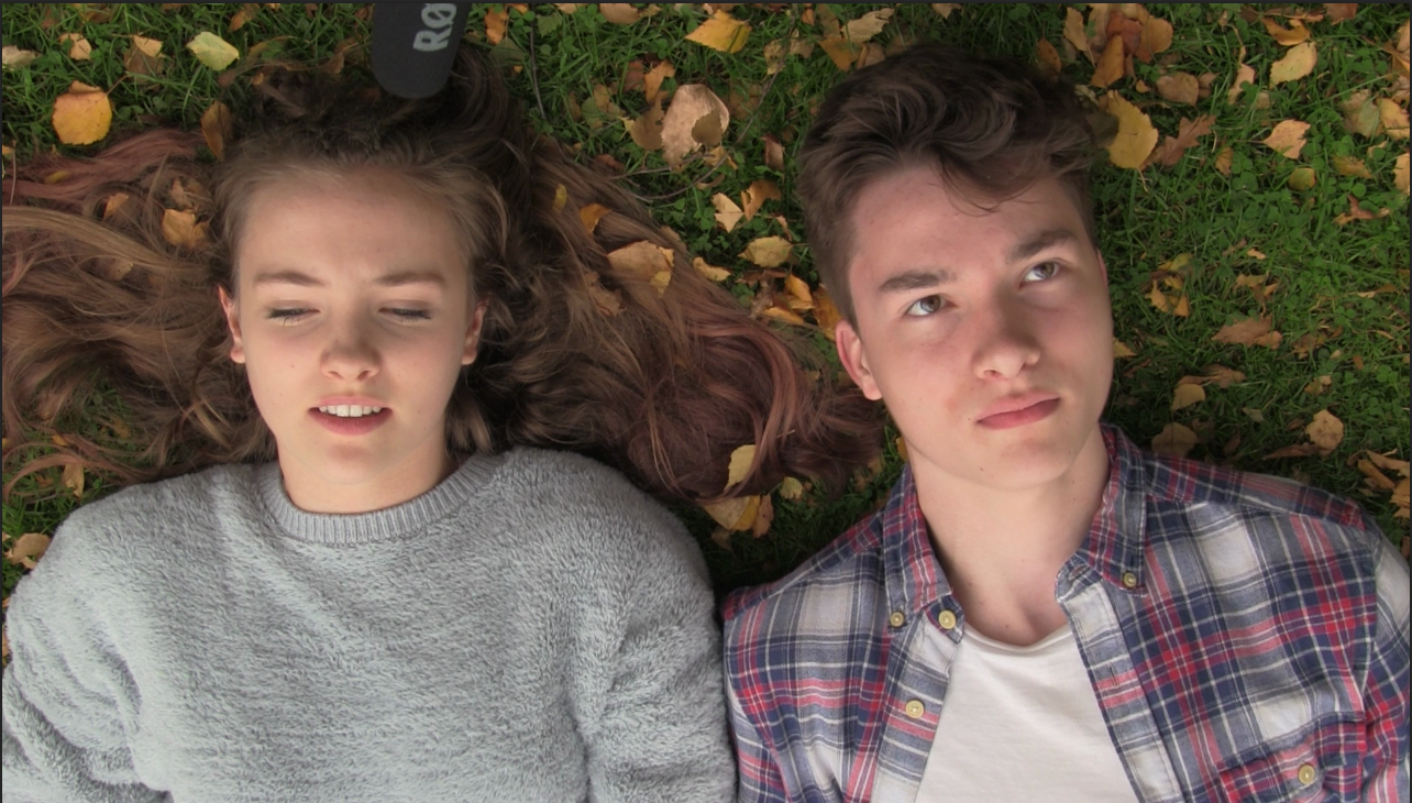
Initially, I wanted to go for a poster to reflect the happy nature of the first act of the trailer, but with some deformity showing how everything is not as it seems. I decided to go for this shot from the film as I thought it was a very nice looking shot and I could do lots with it.


However, I could not find a still from the film where both of the actors were looking nice - as you can see here, it looks like our main actress is mid-sneeze. I chose to use two different stills, which I carefully blended together to give the result below.


I'm really pleased with the result - you can hardly tell that there are two shots there - the discolouration on the girl's hair was actually an in-camera error. After blending the photos, I added a levels adjustment to increase the contrast a little - the final grade is on the top, original on bottom for comparison, as it can be quite difficult to see the difference otherwise.


I added in the title from the film - this creates a brand coherency we were keen to achieve with our ancillary marketing products.


I then started to add some film festival logos, like these ones:


Giving a final, unfinished result:


However, in the end I decided that my initial idea was flawed - I felt that this kind of poster didn't truly reflect the thriller genre, and wouldn't be able to get across the intended meaning effectively. I scrapped this project, and started again.

Wednesday, 15 November 2017

Rough Cut 1

Here is the first rough cut for our final product, we have put all of the clips filmed on day 1 and 2 of filming together along with the idents. The colour grade has begun on some of the shots but there is still a long way to go on many. Currently the only sound for all of it apart from scene 1 is camera sound so this will need to be replaced with sound from the Digital Audio Recorder. Also currently it reaches 2 minutes 48 seconds in length with still 4 scenes to film, making it well over our target of 2 minutes so we plan to cut a large amount of it down.